✦ Problem
✦ Solution
Team : 2 Project Managers, 4 Developers
Duration : 4 Months
Tools : Figma
15% more user retention is expected based on survey results
✦ sneak peek
The problem was known, so I started with interviews. 3 user interviews, 20 min each - remote, Semi-open questions later, one main theme emerged.
But how does an E-wallet enhance users trust in automatic payments?
Keep scrolling to find out
⚙️ 🛠️
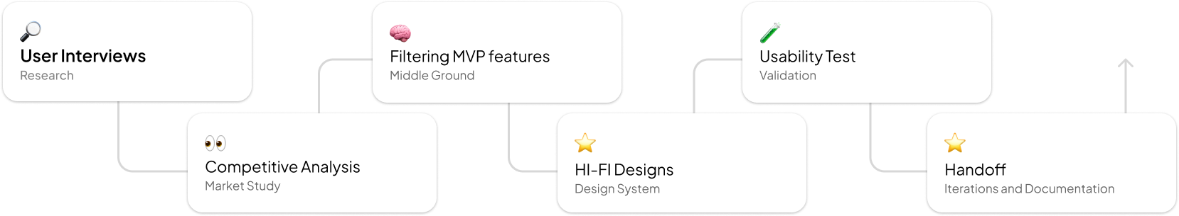
✦ product roadmap
This was not a linear process.
✦ Explanatory User research
The problem was known, so I started with interviews. 3 user interviews, 20 min each - remote, Semi-open questions later, one main theme emerged.
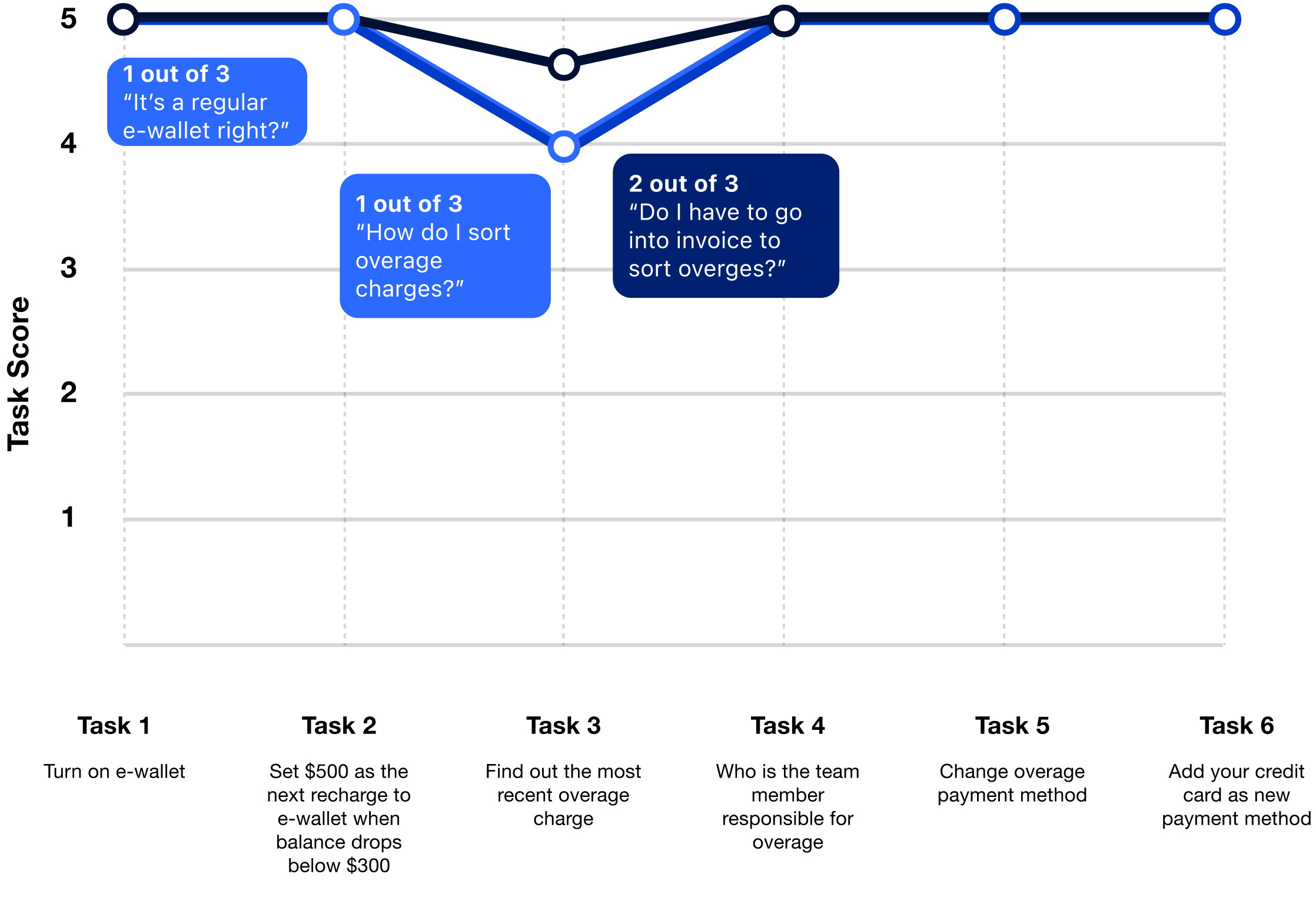
Persona 1 indicated trust issues : "What if they charge me more?"
Persona 2 indicated lack of clear communication: "Variable fee became like a hidden fee"
Lack of trust in auto-payments
Mostly because users weren’t notified about extra fees on time. They needed timely updates to avoid surprise charges.
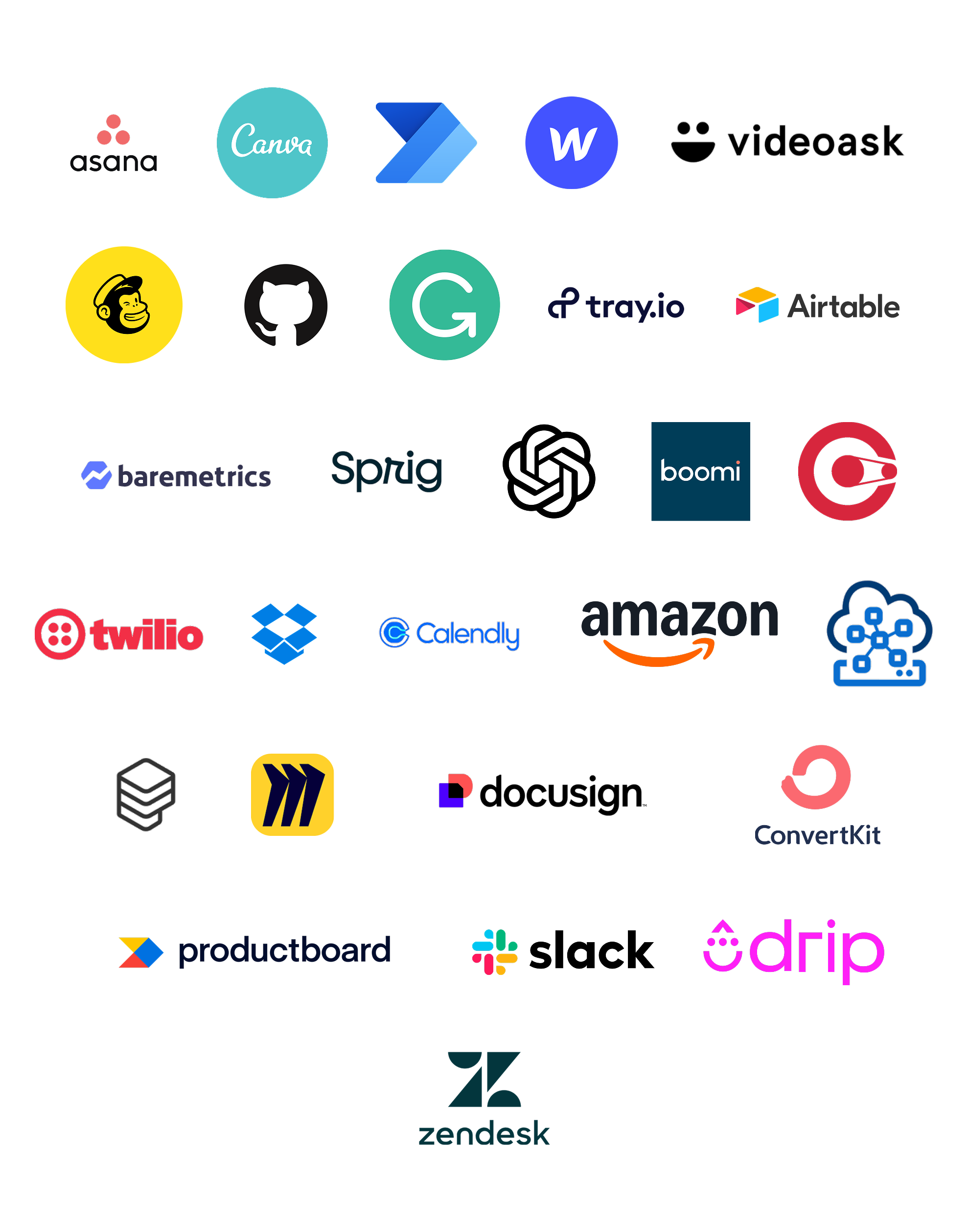
✦ Competitve analysis
When I audited 30+ competitors, I came across Twilio, which offered an e-wallet but with more control. When users balance fell below the set amount of $10, a user set amount of $20 can be sutomatically recharged to the e-wlalet. This gave users more control over the auto-payments.
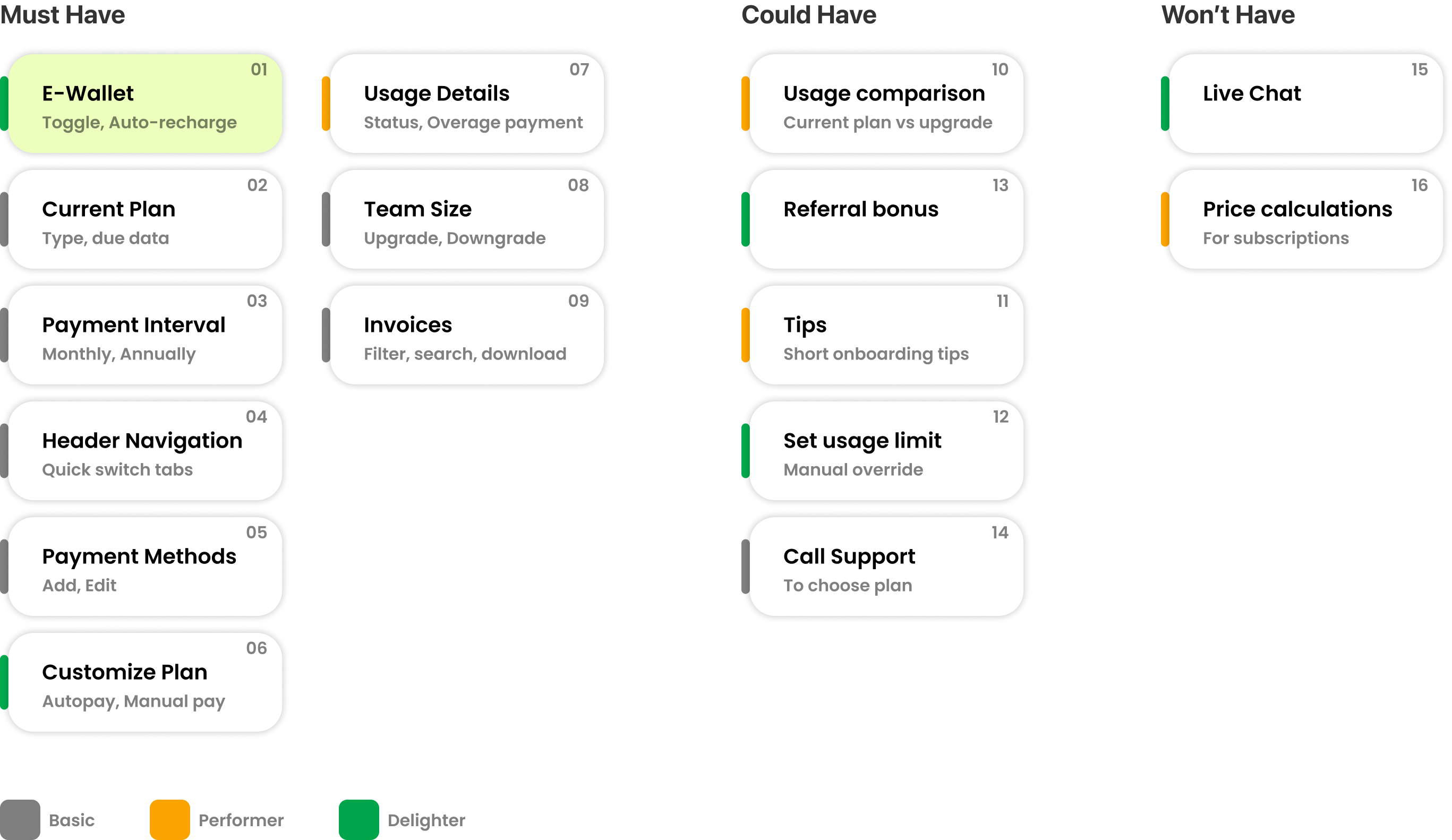
✦ MVP with MoSCoW method
Defining success, collaborating with the PM
✦ Wireframes
Fail, but fail fast. Low fidelity was chosen for wireframes because speed of iteration and refinement was more important in a startup environment than fidelity.
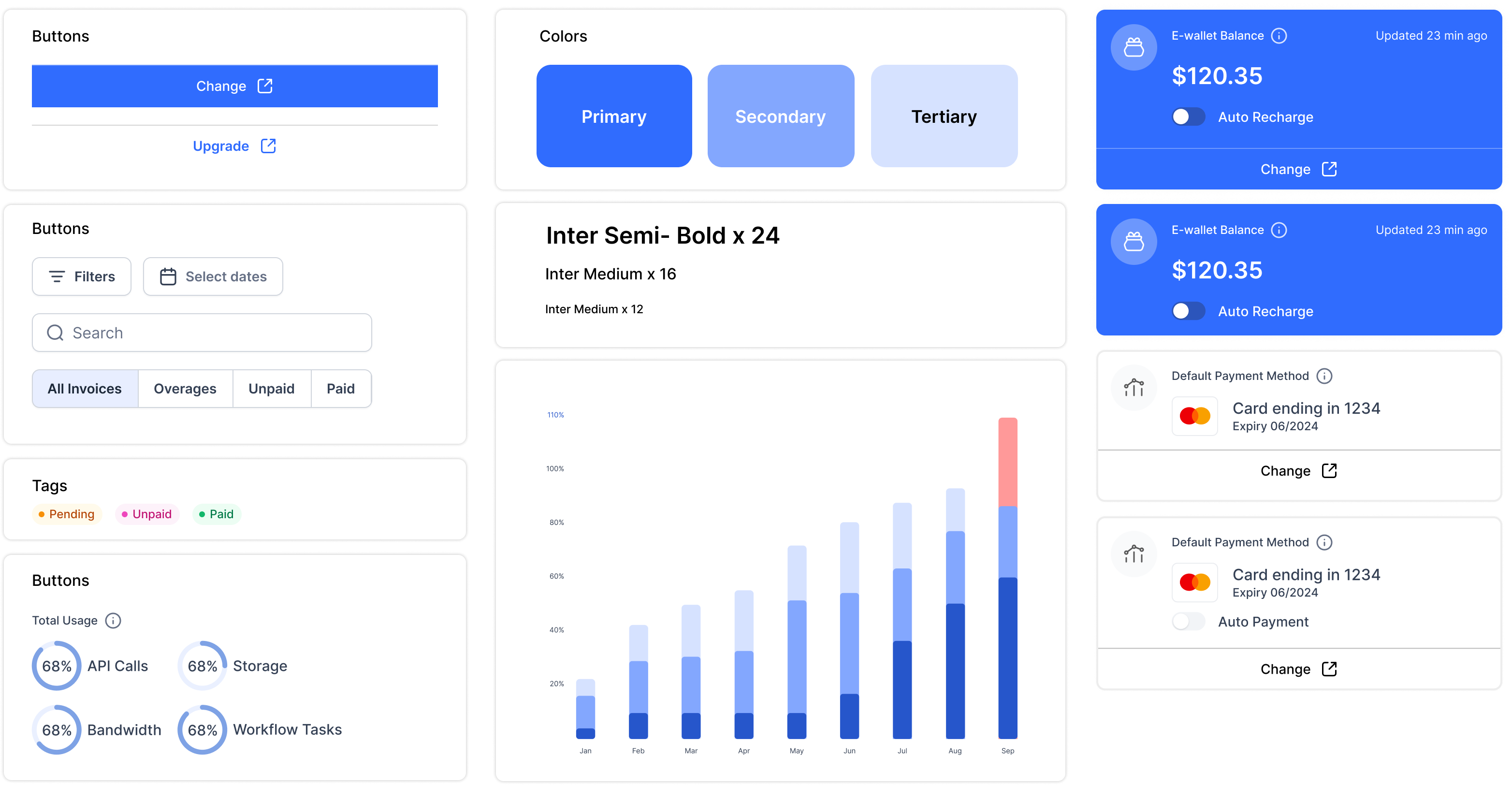
✦ Design system
Developers and the client loved using untitled UI as the design system. It helped in saving time, effort and money.
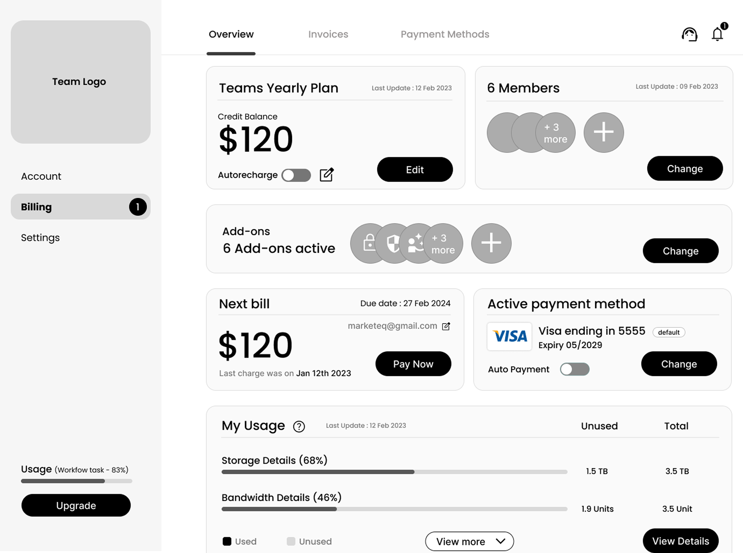
✦ Final design

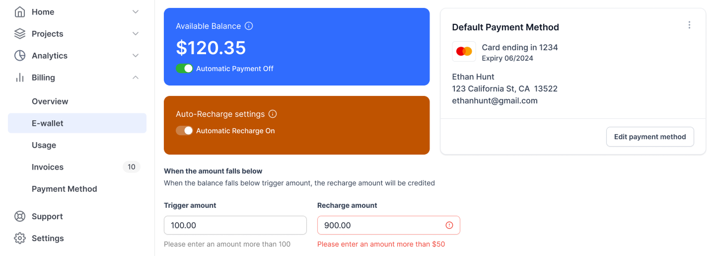
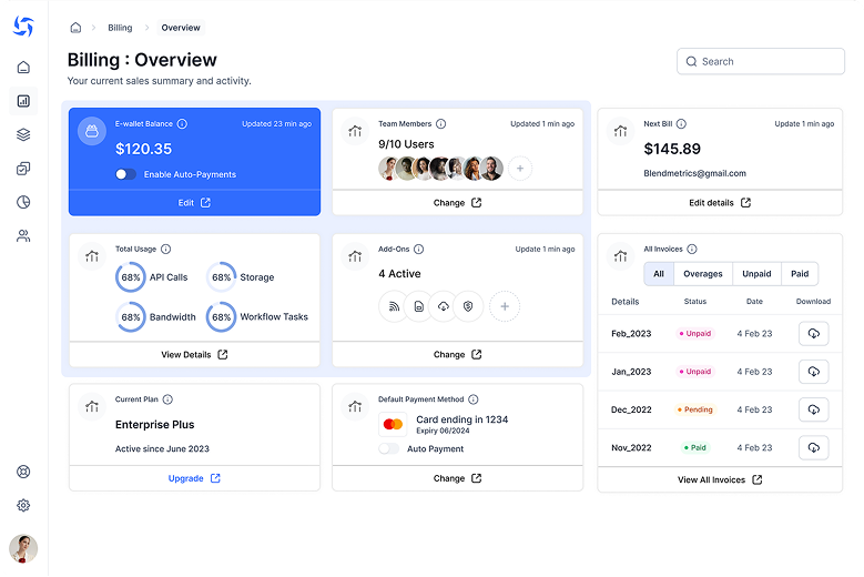
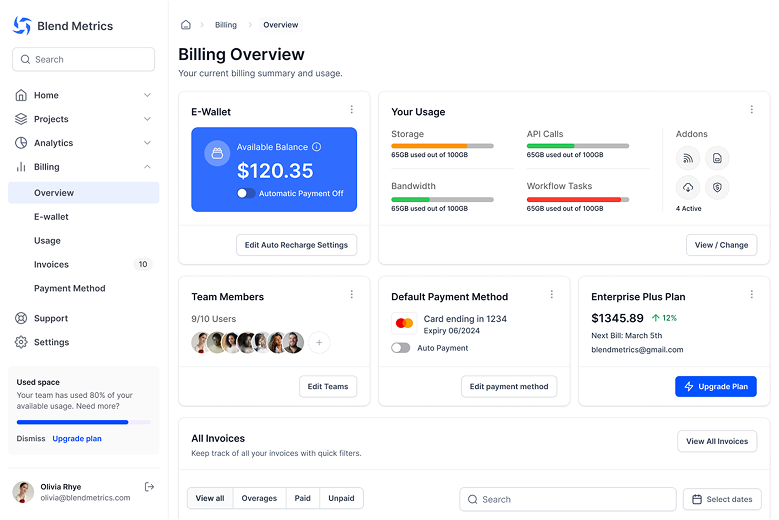
Automate Payments with E-wallet - Now usage charges are taken out of e-wallet for an uninterrupted services.

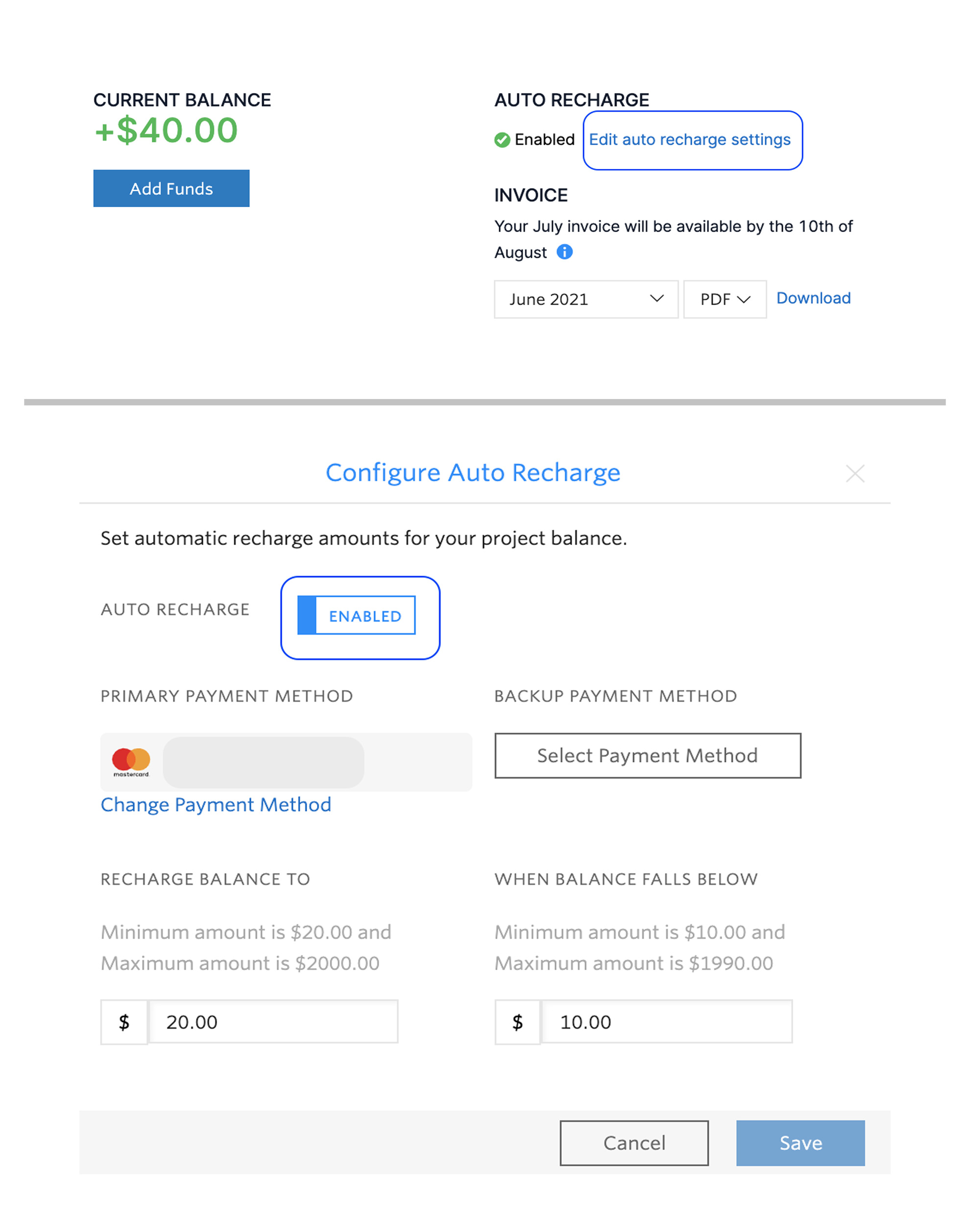
The client loved e-wallet Automation - Admin can set a trigger amount and recharge amount to automatically top up their e-wallet. The client loved this because users will be making early payments.
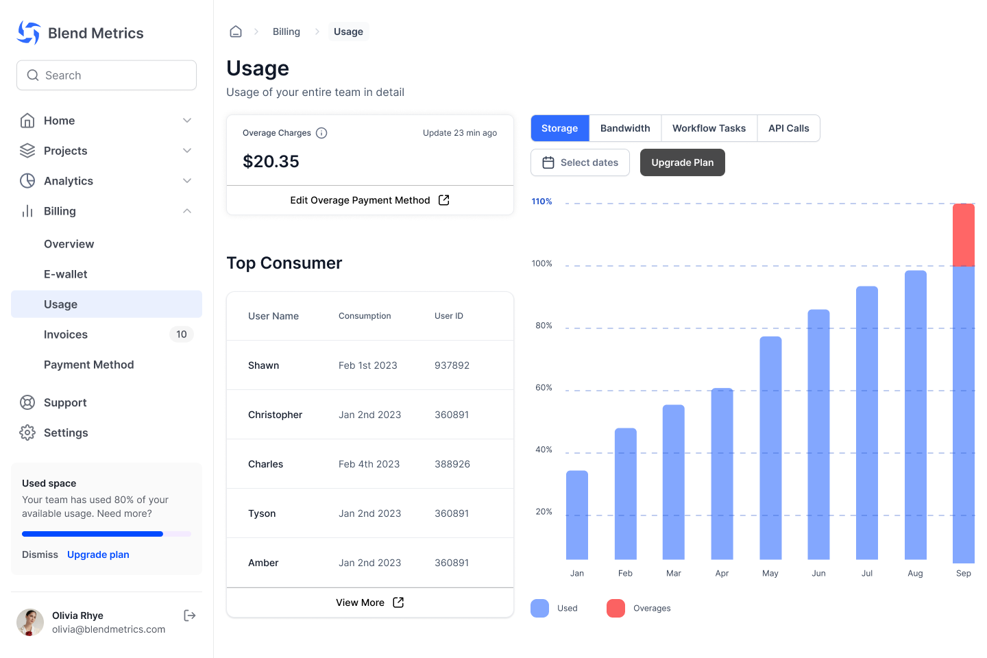
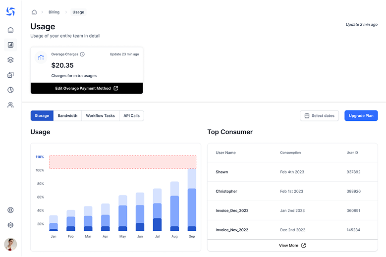
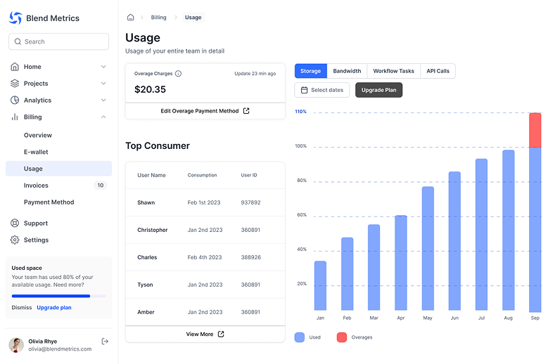
Usage - View overage usage, identify the top consumer responsible, and set a payment method for overages.
✦ Usability testing results
3 Participants, 2 hours and 7 tasks per person were involved in testing if weather the app is easy to user
✦ Iterations based on usability test findings
Making E-wallet and realted features more prominent -When automatic payment is turned on, the color used in usage disspears, indicating that there are no more limits.
Before
After
More emphasis on visual data - Sorting out what’s the monthly subscription charge and what’s the overage has never been easier!
Before
After
Easy overage charge filtering - Sorting out what’s the monthly subscription charge and what’s the overage has never been easier!
Before

After

✦ Learnings
Next up ...
Built with lots of caffeine, love, and Webflow
Ebin Jose © 2025

